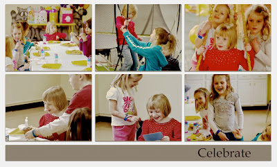
 My daughter celebrated her 6th birthday yesterday. We had a birthday party for her at Recreations, Unlimited. They allow people to rent the facility and a party room for a couple hours so the kids can play on all the play sets and trampolines set up in the large showroom. It is a fun place to be and the kids had a great time, I think, despite the fact that only about 7 girls showed up. I don't think Margot minded that the size and splendor of her party was much less than the other party going on at the same time in the facility. They had many kids, a huge professionally-made dinosaur cake, perfectly matching dinosaur decorations, 3 large bunches of foil balloons.
We had a tray of homemade cupcakes, decorated with sprinkles and party picks, no balloons (that was the one thing Margot did notice at the end of her party when the other group was carrying out all the balloons) and a little paper banner that we couldn't even get to stay up. So if this was a parent competition, which I sometimes fear that these types of kid-experience events have become, I would lose hands down. Although I notice the effort that the other parents went into making their son's party, I do not dwell on that; I don't actually think it is a good idea to go too far overboard with a kids' birthday party anyway.When I think about the birthday parties I had as a child, it never involved more than sitting around the picnic table outside with cake, ice cream, presents and pin the tail on the donkey. Actually, my birthday party was often combined with the neighbor girl's because she had a birthday three days after mine.
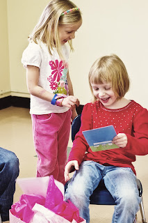
It is the friendship and giving and giggling and smiles that the children are really enjoying. The cake matters least. What strikes me about these parties is how much fun the children have when the gift opening is initiated and it is those who are doing the giving are having just as much fun and the birthday child . . . so much joy when a gift given is loved. That is what counts.
Shifting gears:
I put together the mosaic above using one of Kim Klassen's storyboard templates. I posted it on Facebook, but then later came back to it and decided it was too light. The one in this post is darkened up a bit, but I am finding that I am having more and more trouble making processing decisions. I have Rad Lab as a plug-in to Photoshop. I really love the program but I often fear I over-process and do not have my eye quite tuned yet to what a photo should look like or how to make the best choices. Yes, I know a lot of that is a matter of taste, but I also think perhaps not all of it is. What is the best way to learn and see and make the best choices? Is there a book on processing (not the technicalities of a program but the best way to get a look and feel just right)? I do believe that Kim Klassen's beyond layers class is going to help with this and I just need to move through that and perhaps try to focus more on developing a certain style or a few. I know in the past my photos were very lightly processed. That was largely due to not knowing how to use the programs and not knowing a thing about Lightroom presets, Photoshop Actions, Rad Lab, textures, layers, etc. Now have I gone too far? Hard to say, but I would like to try to focus on that a bit.
Also with the above mosaic, perhaps I should have applied exactly the same processing steps to each so the would be consistent. Any suggestions on that? Better to have them all look about the same or okay to be a little different? Also, are some of the skin tones too warm and 'orange-y'? I struggle with that as well. Most people seem to say warmer skin tones are better, but sometimes I think it does not look quite as natural as it it should. Anyway, if anyone does have any suggestions for processing, I'd love to hear them.
Anyway, below are some other photos (some of the same ones from the mosaic) from Margot's birthday party:
Waiting for the festivities to begin:
The fun begins:
Three best friends forever:
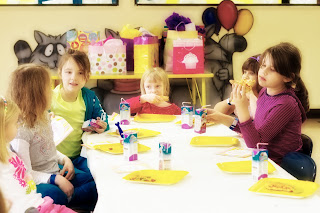
Time for pizza:
"Raise your hand if you love pizza"
Time for singing happy birthday, cupcakes and ice cream. Margot's big brother delivered her cupcake with the candle on it!
Yay, presents!


Hi Bonnie, You ask a million questions, but I have a few answers. For the most part, you are right about a matter of taste. Your story board is awesome. I found that it is easier to put the photos in the story board, then do the processing, the textures, everything. You mentioned the red in the skin tone. One thing I do is a hue saturation adjustment layer, choose the red and lower it a little. Sometimes I need to do the yellow too. A couple of your pics, I think it was 10 and 11 I would have done that with the yellow, just my opinion. -Roxi
ReplyDeleteGorgeous pictures! My daughter was 6 on Friday and had a party Saturday, so we have had the same kind of weekends! I agree with you on the party thing - my daughter had 5 friends over for a party at our house and they had a great time - playing their own games mostly - with a few party games and some craft. It was lovely. Re: your processing questions for the storyboard I put mine in the collage then put a warming filter over all of them to lend some cohesion. I notice some people put a texture over to acheive a similar effect. Personally I think the colours that are in your images pull it all together anyway - I did mine as a time capsule of a day and the different subjects and light from the time of day were all over the place! I'm having a play with in-camera white balance as indoor lighting can make everything very yellow. In photoshop, I use de-saturation too. Kim's classes have been great for photoshop technique, then it's a lot of trial and error, lots of experimenting and as you say, personal taste. :)
ReplyDelete